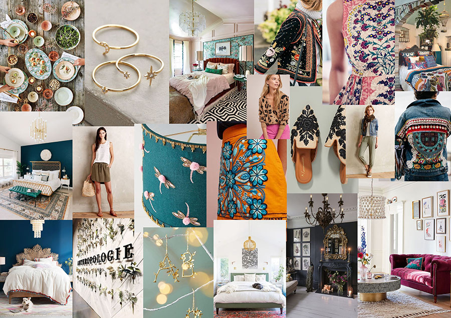
I chose the bottom right picture because the lighting, space and diversity of colours represent the brand and show multiple products that the brand sell without being obvious on what they are advertising. The second one in from this image shows a different colour scheme, it is dark but still well put together and exemplifies the brand’s clean but plentiful approach to design. In contrast to this, the top left image has a theme food related and shows a more social focussed theme that the brand can offer to bring to customers. To the right of this, a close up shot of jewellery is presented. All images show Anthropologie’s diverse product range and keep an integrated professional, clean approach to imagery.
-
Subscribe
Subscribed
Already have a WordPress.com account? Log in now.
